Tips to create easy Tag Cloud Artwork
The first thing to do is create your word list. Usually you will want to do this over a few days as you think of them. You can never think of a decent list all in one go, and really the more words the better. Depending on how big you plan to print the thing you will really need 200+ words and having 500+ will get you a much more interesting picture. When you think of a few more, don’t forget to write them down!
It is easiest if you can find a way to store the list online (as a text file), so when you make the art, you can submit the online list rather than having to upload or paste a file each time. Talk to a techo friend to help you with this otherwise just create it in a text or word file.
When you have your list, sort it into most important words at the top. When the art is displayed, these will generally appear in larger font and progressively get smaller.
Some Tips
 - Use one word per line
 - try to avoid spaces, but if you want two words to appear together you can use the tilde (~) character in between them (e.g. Keen~Sailor).
 - If you plan to use any numbers, you will need to change this setting in the Tagxedo settings
 - I'd avoid  special characters like %$* or even apostrophes, but the settings can allow these too
 - Tagxedo will often treat some words the same such as, "sting", "stang", and "stung" and "fly" pairs with "flies", "formula" pairs with "formulae" etc.
go to here to start your creation: http://www.tagxedo.com/
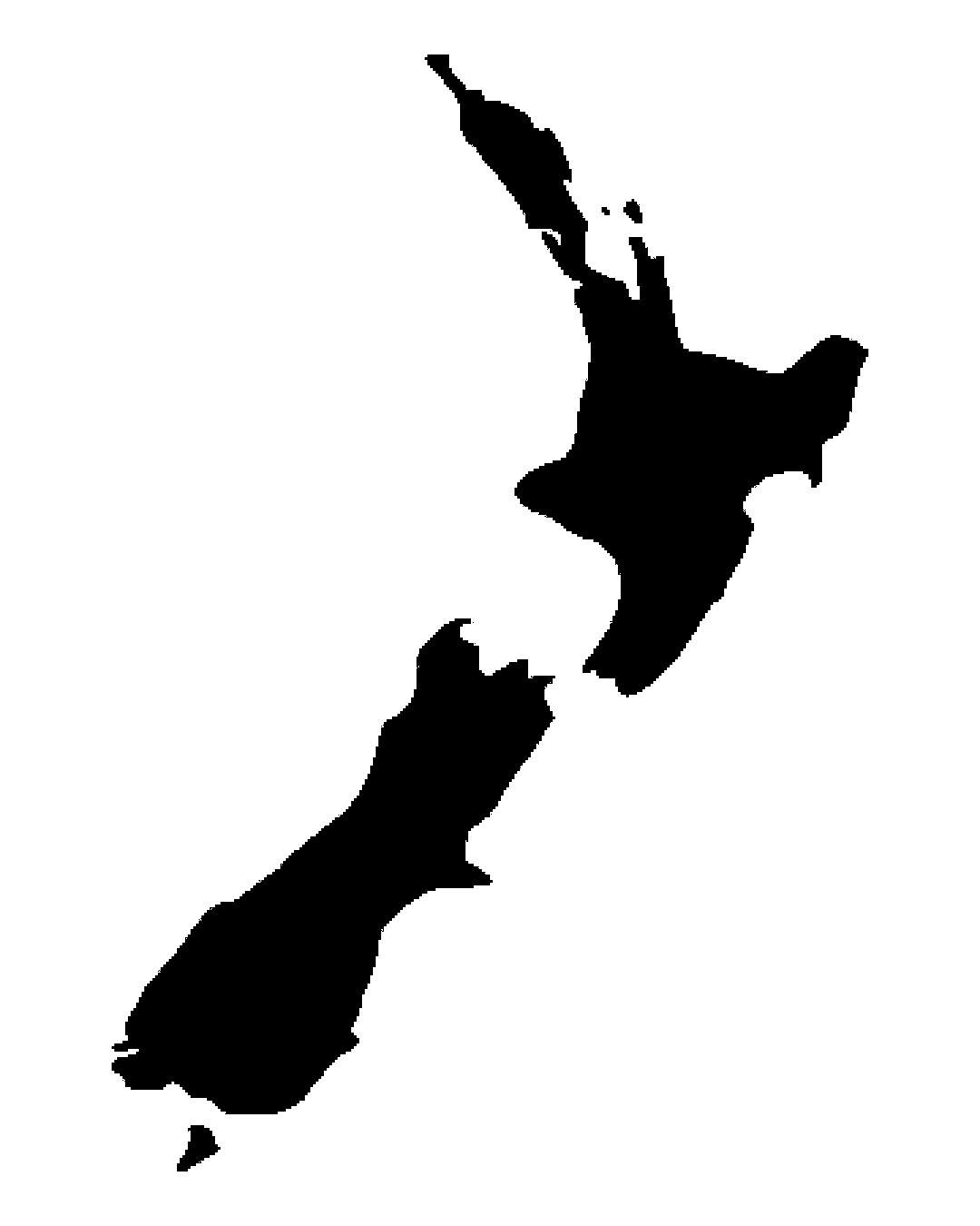
– Click the ‘Shape’ button to choose the image (use one of theirs, or click to upload your own)
– Click ‘Load’ to put your words in. Either online list with a webpage if you have managed that, or copy/paste all your words into the box or choose your text file to upload.
– Click ‘Word | layout’ options to check a few things eg allow punctuation, numbers, common words such as “is”, “are”, “do”, etc. Also this will allow you to skip some words in your list.
Try lots of layouts until you are happy with one… Heaps of options to try. Each time you change one of the many options such as Font/Theme/Orientation it will ‘Respin’ your design. It can be frustrating to try lots of options and get ‘not quite there’ but make sure you save some completed Respins as you go in case you want to go back to one that you liked more than the others. I personally have played with some designs for hours to get it right.
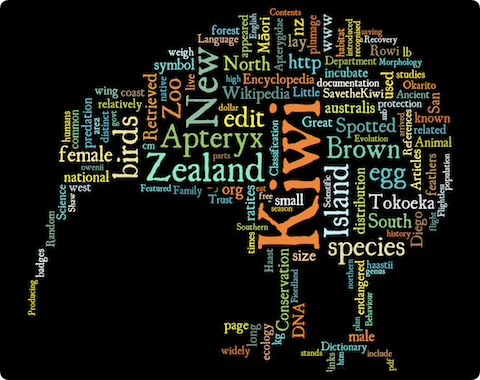
Some Options to try and more tips
 - Play with the gaps between words for different looks.
 - Try playing with horizontal only or vertical only words rather than having them go in all directions.
 - Words can be repeated, or just used once.  You can change that setting.  If you only have a small list, then you might need them to repeat.
 - Play with the colours and try not to go insane on using different fonts.  Often just one font looks the best.
 - Try putting the words 'outside your picture' instead of inside
 - Play with 'All-caps' or 'All Lower Case' Word lists.
 - Try multiple wordart pics joined together (or in one of those multi-picture frames)
 - The tightness setting fits more words in, and other settings also create complexity, but it takes longer to 'Respin' each time as it becomes more complex
 - If you use or create a more complex silhouette, ensure the picture is actually recognisable, once all the words are in (I've made that mistake!)
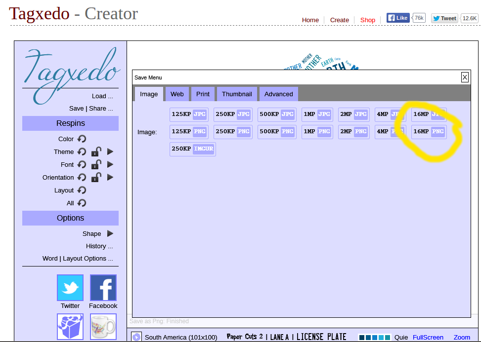
To save, click ‘Save | share’. Choose the 16MP .png option (or possibly .jpg if you want to, but png should be slightly better). Download the file to your computer.
When you have downloaded it the art will have a border with the Tagxedo logo on it, but you can remove this with a graphics programme should you desire (I would!). It is also recommended to make the background larger around the edge if you can (again in your graphics programme), so that when you print it and place it in a frame, you have more options to trim it or crop it the correct size.
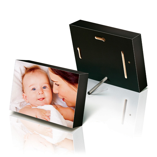
Print as you like, eg on photo paper, as a card or calender at an online photo company, or locally at a printing company and mount on a block or in a frame.